Project
Lumen
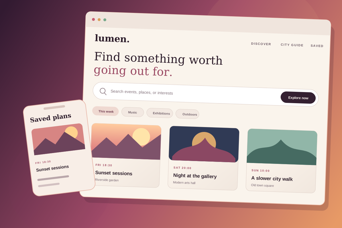
A calm event discovery concept that helps people browse, compare, and save local experiences.
- Role
- Concept direction · Experience design
- Stack
- TypeScript · React · Next.js · CSS · Git · Figma · Playwright
- Period
- Sample concept
- Outcome
- Calmer discovery
Overview
Local plans, easy to explore.
Sample concept. Lumen is an illustrative project created for this portfolio. It is not a released product or a client engagement, and the decisions below describe a proposed direction.
The problem
Finding a local event can involve dense calendars, unclear filters, and cards that hide practical details until late in the journey. Comparing a few options quickly becomes harder than it needs to be.
Lumen explores a calmer discovery flow built around time, place, accessibility, and the kind of experience someone wants.
Role and constraints
The concept covers experience framing, content hierarchy, and responsive interface design.
- Essential event details should be visible before opening a detail page.
- Filters should remain understandable on narrow screens.
- Saving an event should not interrupt browsing.
- Ticket sales and organizer tools are outside this concept's scope.
Architecture and decisions
The proposed website uses Next.js for indexable city and event routes. Server-rendered results provide the useful default, while a small client-side filter layer updates the current view without turning the entire page into a client component.
Event cards use a consistent information order: date and time, title, venue, format, and access notes. A compact city guide groups related events without replacing the primary result list.
Interaction and accessibility
Filters use native controls with persistent labels and an explicit apply action on mobile. Saved-state feedback is announced to assistive technology and does not rely on a changed icon alone.
Cards remain ordinary links, focus styles stay visible over photography, and motion is limited to short state transitions that respect reduced-motion preferences.
Result and next steps
This concept produces a responsive browsing direction, not measured conversion data. A useful prototype would test the event card, the mobile filter panel, and a saved-events view with realistic content lengths.
Lessons to carry forward
Discovery interfaces work best when practical details are part of the first scan. Strong information hierarchy can make a broad catalog feel calmer without removing useful choice.
Visual showcase
Results
- 3
- Primary discovery paths
- <3
- Steps to save an event
- 100%
- Responsive views target
- AA
- Contrast target
Let's talk
Let's build something.
Have a project in mind or just want to say hello? I'm always up for a good conversation.
Let's talk